David Goldklang, designer
Foundations that let teams move faster
Color architecture, multi-brand theming and token systems, from a global crypto exchange to four retail brands to my own apps.
The system lives in code
Design files drift from the product, because every change has to be rebuilt in code by hand. So I build design systems that live in the code itself: one source of truth, with every tool reading from it.
- One source of truthTokens, components and docs come from the same repo.
- Updates are pull requestsChanges to the system are made and reviewed in the repo, like any code.
- Agentic and connectedAgents and tools work from the real system, so nothing gets out of sync.
At Green, I built this for its design system: a docs site, a tool that compares components side by side, and updates made as pull requests on the system’s repo. Full case study on request.
Two copies, translated by hand. They drift apart.
- Docs site
- Comparison tool
- Product
- Agents
Everything reads from one place, so nothing gets out of sync.
OKX
Semantic colors, seamless modes
I architected a next-generation color system and workflows that brought clarity, speed and reliability to dark mode, and design consistency across one of the world’s leading crypto platforms.
- Role
- Initiated, pitched and led end to end
- Owned
- Design, documentation, training, rollout
01Context
A system that couldn't keep pace
OKX is one of the world’s largest crypto exchanges, scaling fast with a complex product ecosystem. The design org needed its system foundations to keep pace with rapid growth, but adoption and consistency were faltering.
When I joined the team, I wanted to understand how designers were actually using the system day to day. I set up workflow walkthroughs with product designers across the org. Very quickly, I noticed a massive pain point: the color tokens.
02The problem
Designers and developers had lost trust in the color system
- Dark mode was brokenDevelopers had to apply manual overrides because tokens didn't swap correctly.
- Semantic naming was unclearDesigners often chose colors visually, not semantically.
- Duplication and ambiguityToo many similar tokens made decisions confusing.
- Inefficiency and inconsistencyWorkarounds created drift between design and code.
This wasn’t just a technical issue: it slowed teams down and undermined confidence in the entire design system.
03The opportunity
Transform how the org thinks about color
- 01Simplify the architecture with clear, semantic categories.
- 02Make dark and light mode reliable and automatic.
- 03Reduce duplication and cognitive load for designers.
- 04Rebuild trust through education and adoption support.
04My role
From noticing the gap to shipping the fix
- Project initiationObserved designer workflows, identified critical color system gaps, and proposed a systemic overhaul.
- Stakeholder presentationCommunicated risks and a structured redesign plan to the design org and leadership.
- Leadership alignmentBuilt confidence and gained organizational support to move forward.
- End-to-end executionOwned design, documentation, training and rollout of the new color foundation.
05Process
From audit to adoption, in seven steps
 01Research and analysis
- Interviewed designers and observed workflows to uncover pain points.
- Documented token misuse, inconsistencies and reliance on overrides.
 02Early engineering alignment
- Engaged the infra dev team early to validate feasibility.
- Defined token structures and long-term adoption processes.
 03Architecture redesign
- Reorganized into 4 categories with clear intents.
- Built in dark and light mode and theming flexibility.
- Reduced duplication and clarified semantics.
 04Brand color and components
- Partnered with the component designer to apply tokens across the library.
- Updated core components: buttons, inputs, alerts and more.
- Established guidelines for brand color usage.
 05Implementation and rollout
- Published tokens into code with the infra dev team.
- Rolled out in phases: system components, then product teams.
- Let old and new tokens coexist for a smooth migration.
 06Education and workshops
- Built before-and-after templates and guides.
- Hosted training sessions and workshops.
- Embedded with teams for adoption support.
 07Iteration and feedback
- Refined primitives and semantics from usage feedback.
- Added missing semantics during rollout.
- Improved documentation for clarity and longevity.
06The solution
Four categories, one intent each
- A semantic color system that's intuitive and easy to navigate.
- Dark and light mode switching that works instantly, without overrides.
- Fewer, clearer variables with meaningful names.
- Documentation, guidelines and training that ensured adoption.
07Impact
Dark mode that just works
- 0%
- fewer duplicated tokens, simplifying decisions across design and code
- 0+
- product teams actively migrated during the first rollout
- 0%
- faster onboarding for new designers learning color semantics
- 0
- developer overrides required: dark mode works out of the box
08What designers said
Easier, faster, and it makes sense
I’m so excited about the new color variables! They’re so much easier to use and way faster than what we had before.
It feels magical to switch to dark mode now. Everything just works instantly.
The new structure just makes sense. I don’t have to guess which token to use anymore.
Gap Inc.
One system, four brands
I unified four global retail brands under a single scalable theming system, changing how Gap, Old Navy, Banana Republic and Athleta deliver distinct yet consistent ecommerce experiences.
As a contractor in 2024, I built the new design system from scratch to support all four brands.
01Context
The reality of multiple brands
- Four brandsGap, Old Navy, Banana Republic and Athleta, all owned by Gap Inc.
- Same flowsEach has a unique visual identity, but nearly identical ecommerce flows.
- Separate teamsEach brand has its own product team and design agency: duplicate work and inefficient maintenance.
02Challenges
Every feature and fix, built four times
- Delivery speedEvery feature and fix was built four times.
- InconsistencyEach brand's team and agency solved the same problems in its own way.
- Maintenance costUpdates, bugs and accessibility fixes multiplied across teams.
- Brand refreshesAnnual rebrands were slow and hard to implement.
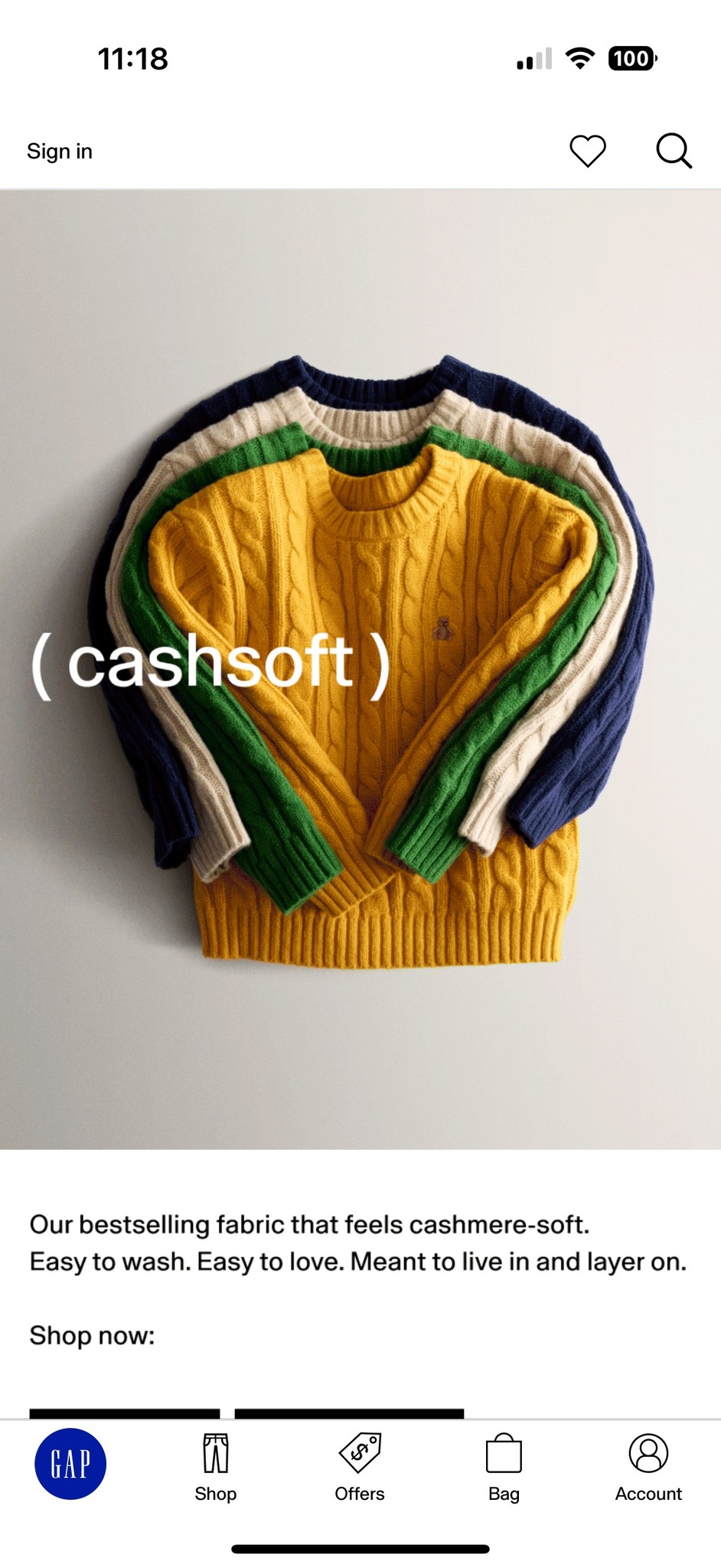
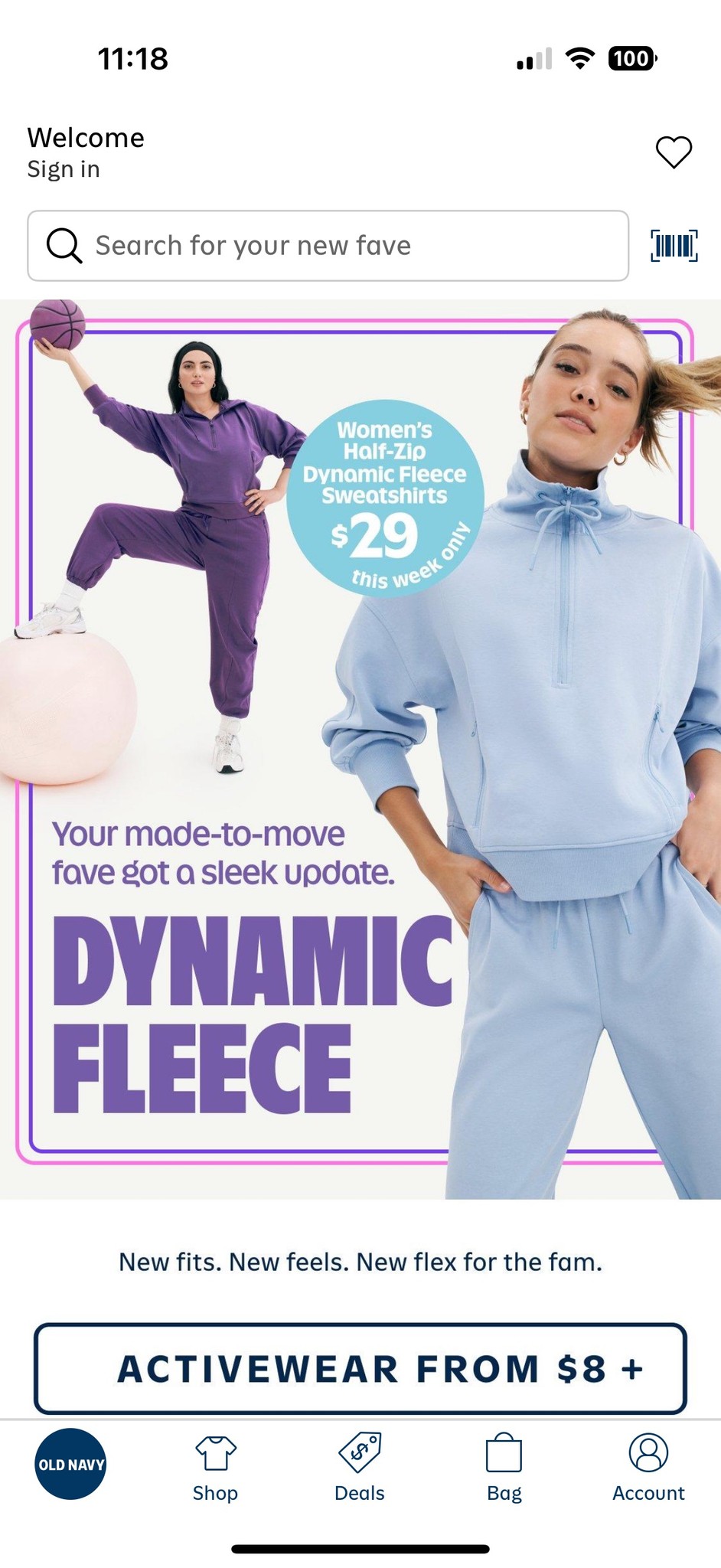
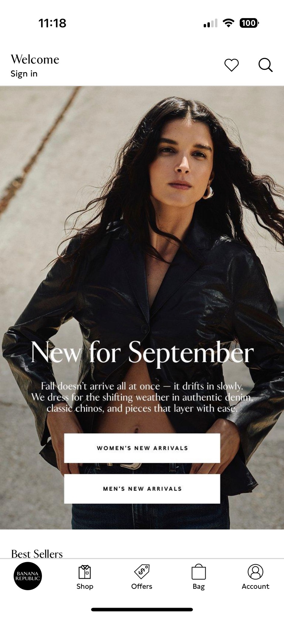
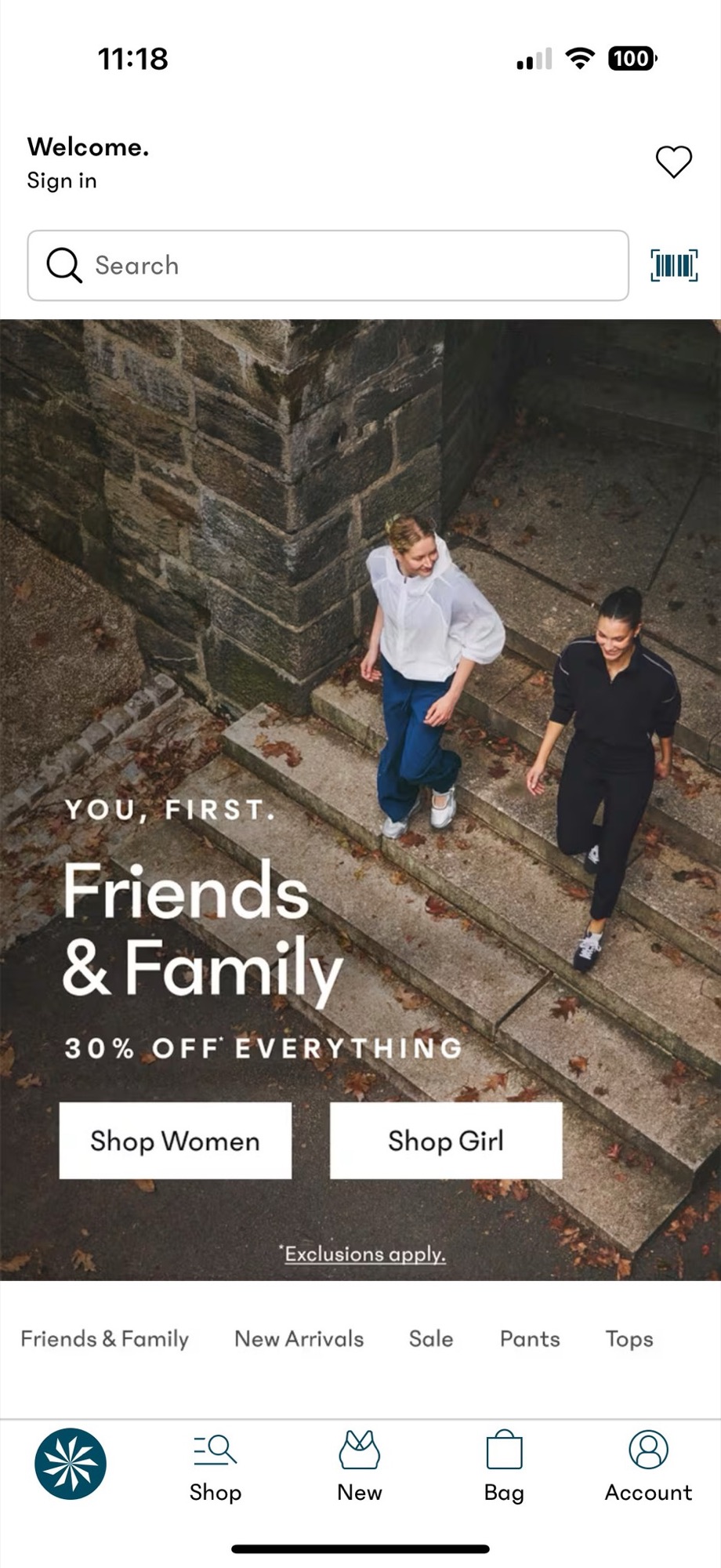
The same app home screen, four times over. Tap a brand to see its version.
03The opportunity
Build once, theme everywhere
Using Figma variables and modes, I proposed a unified component architecture that adapts to each brand’s look and feel through theming, without rebuilding components from scratch.
- Scalable themingComponents that flex visually per brand.
- Lower maintenance costLess redundant design and dev effort.
- Shared infrastructureBuild once, deploy everywhere.
- Faster refresh cyclesAdapt quickly to rebrands.
04Process
Research, hypothesize, workshop, build, design
- 01Research
Gathered references from existing design system components and styles, live product screenshots and Storybook implementations. Reviewed agency vision work to understand future needs, and researched how other systems handle theming for multiple brands.
- 02Hypothesize
Brainstormed and recorded approaches to organizing variables and styles, and identified how component variables would need to work to accommodate brand divergence.
- 03Workshop
Presented research and ideas on structure to stakeholders, and to designers and developers who knew the current tools and experience.
- 04Build
Mapped out the variable structure and created the variables to match in Figma.
- 05Design
Broke apart the product page buy box and rebuilt its components with the new variables, then built a proof of concept of how theming lets brands diverge through variables and modes.
05The solution
One foundation, four brands
- A multi-brand design system architected from a single foundation.
- Shared components that adapt visually through variable modes.
- Unified documentation across Figma, Zeroheight and Storybook.
06Impact
Weeks of work now happen in hours
- 0%
- faster multi-brand updates: refreshes that took weeks now take hours
- 0+
- shared components standardized for consistency and flexibility
- 0
- brands unified under one scalable architecture
- 0%
- less duplicated effort across design and development
07What partners said
Technology working for the design
This approach fundamentally changes how we operate as a multi-brand organization. Instead of rebuilding for every refresh, we can now evolve our brands at the speed of strategy.
The new system eliminated so much duplication. We’re now building faster, testing faster, and staying visually consistent across teams.
The system supported each brand’s distinct style without compromising its integrity. It felt like the technology was finally working for the design, not against it.
 OuterBrain
Every color answers one question
Color in OuterBrain is semantic: each one has a single job, so the screen stays calm and anything colored means something.
- Neutral
- Interactive
- Accent
- Danger
- Quiet
01Color intent
Five rules
- Neutral is the defaultContent and ordinary controls stay neutral.
- Interactive means press thisOnly on controls: the main action, the selected choice, links.
- Accent means now, or needs youOnly on status: the now line, a running timer, a waiting count.
- Danger means this destroysOnly the confirming press of a destructive action.
- No decorative colorWhen nothing is happening, the only color on screen is the main action.
02Theming
Ten palettes, one system
This site runs on the same system. Tap one to try it.